Building the site
Hello again! This is a continuation of my previous article about picking the technology to power my site. If you’d like to catch up, read it here.
Today, I’ll share what I did to quickly get this site off the ground.
A quick review
The goals I had on my website were to share my knowledge, and to share my projects. To do so, I need to make sure my site is easy to write, easy to read, and easy to share.
I found that Astro was a good tool for the building my site and managing my content.
Building a template
There’s no need to re-do work that has already been done, so to speed up development, I started this project by starting from a template. The Astro command line setup wizard made this easy.
The Astro CLI
Using this tool, I was able to configure a project with little trouble. I followed the instructions here.
Since I use pnpm1 as my package manager, I used the following command in my terminal to start the setup.
pnpm create astro@latest
Following the prompts, I selected these options for building my project:
- How would you like to start your new project?
- I selected the “Use blog template” option. This worked great for me since, well, I was creating a blog!
- Here’s the repository for Astro’s starter blog template.
- Do you plan to write TypeScript?
- I selected “Yes.” I enjoy having type hints in my code editor to verify the objects I’m working with are exactly as I expect.
- How strict should TypeScript be?
- I chose the recommended “strict” option. While having the most strict option keeps me from going off the rails, I don’t really need to enforce those rules yet. If I change my mind, I can always add them back into my TypeScript configuration file later.
- In Astro’s documentation, they link to the TypeScript configuration they use when building a new project.
The next steps asked if I wanted to install my project’s dependencies and initialize git. I said “Yes” to both prompts. I was going to do those steps myself anyway, so it’s nice for the Astro CLI to take care of that for me.
After some waiting, everything was built and ready to go. I even got a fun message from Houston, Astro’s mascot, wishing me luck in my development!

The initial site
I navigated to my new project directory and started the development server to see what Astro generated for me:
cd my-astro-blog
pnpm run dev
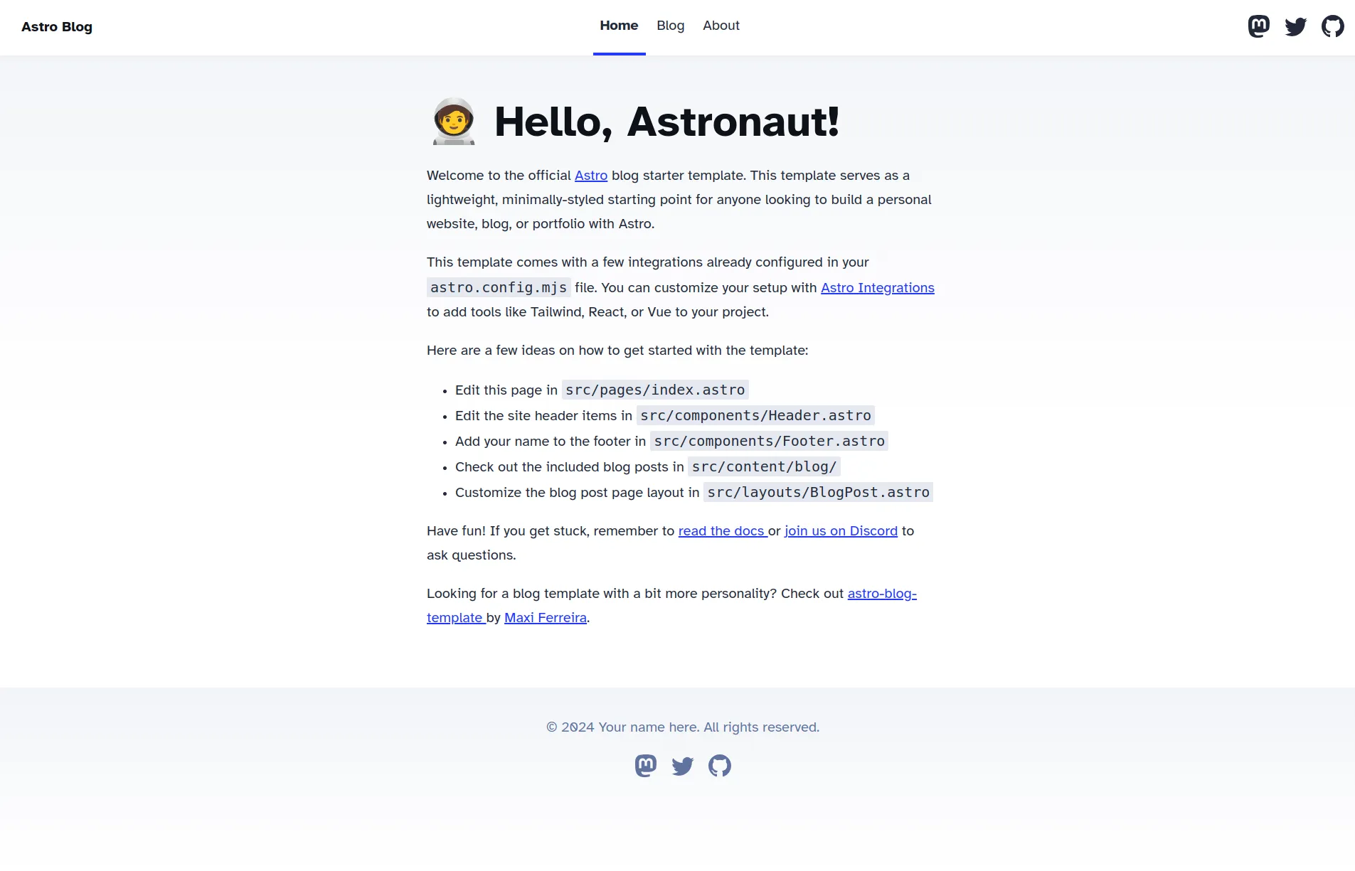
And what I got was this:

For a starting template, this is pretty good. It contains a home page, some sample blog posts, and some images. It was a good collection of files that would likely be in a website.
Although I haven’t written any content yet, this is enough to get started on the next step: building and deploying the website.
Automating deployments
I wanted to automatically build and deploy my site whenever I make changes to the codebase. Configuring this as soon as possible saves me time, making it easy to share my updates. To make this very simple, I’m deploying my website using GitHub Pages.
Again, Astro’s documentation made this process very straightforward. The code to enable this feature was copied and pasted into my project, but I’ll explain the basics. The file’s included here for reference.
The deploy.yml file defines the configuration for automated deployments to GitHub Pages. The name defined in this file labels it as such:
name: Deploy to GitHub Pages
Changes will be made every time I push code to the main branch. This usually happens when I push code in another branch in my repository, and verify they look good in a merge request:
on:
  push:
    branches: [main]
The deployment is split into two jobs, build and deploy. These jobs are also broken down into individual steps:
jobs:
  build:
    # ...
    steps:
      # individual steps for build...

  deploy:
    needs: build # this step can't happen unless build completes
    # ...`
    steps:
      # individual steps for deploy...
Once these two steps are complete, my site will be online and available for all to see. With this configuration complete, I can focus exclusively on writing content and adding features to the site!
Gotcha: colliding deployments
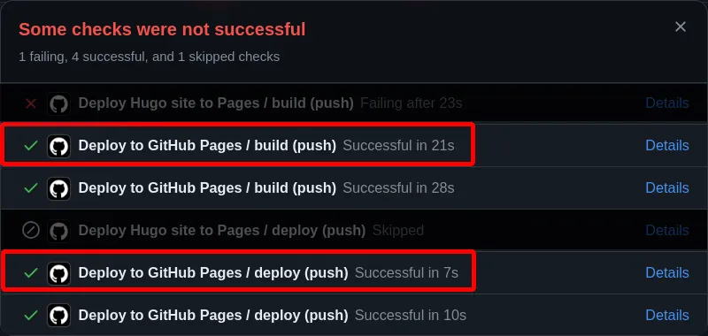
I decided to re-name this file at one point, but accidentally forgot to remove a previous version of the file. Because I did this, I accidentally triggered multiple deployments whenever I pushed code to the main branch. This is wasteful, and also leads to confusing build output.
Consider this commit I made here. If you click on the build status icon next to the commit message, you’ll see that there were more build steps that were executed than expected. They’re highlighted in red in the image below.

Which jobs are the ones I actually care about? It’s difficult to say, but removing the duplicate files made things easier to manage.
Now that my deployments were taken care of, I began building off the blog template.
Although, as you can see in the image above, the original blog template is not bad. However, there were some things I wanted to add to improve it.
More accessibility
Although the blog template boasts a 100/100 Google Lighthouse2 score, it cannot detect all accessibility needs. Manual intervention is required to make sure everything is just right.
Keyboard navigation
For one, I want to allow me to navigate pages with my keyboard. This will make it easier for anyone who doesn’t want to use a mouse to move through the website.
I added a “Skip to content” button in the navigation bar, and a “Return to top” button in the footer, but I also wanted to navigate along different sections of a blog post easier.
Inspired by Astro’s documentation and in a few developer blogs, I wanted to add some links to the end of the headers. This provides a double benefit of allowing navigation with the Tab button, but also making sections of any blog post easier to share.
This is where the rehype-autolink-headings package comes in.
Rehype Autolink Headings
Remember that my blog posts are Markdown files. Astro converts Markdown files into HTML elements when it builds a site. Astro also supports plugins, which can modify the generated HTML even further.
I used the rehype-autolink-headings plugin to help me out. You can read more details about it here.
First, I installed the rehype-autolink-headings plugin.
pnpm install rehype-autolink-headings
Then I added the plugin to my Astro configuration file.
The Astro documentation says that if a plugin needs to define some configuration as input, the plugin and the configuration object should be grouped in an array, and then placed in the rehypePlugins array.
export default defineConfig({
  // ...
  markdown: {
    // ...
    rehypePlugins: [
      // ...
      // vv the plugin         vv the configuration
      [rehypeAutolinkHeadings, autolinkOptions],
    ],
  },
});
The autolinkOptions object is my configuration object, but what’s in it? The documentation for that object can be found here.
const autolinkOptions = {
  behavior: "append",
  // ...
  properties: {
    ariaHidden: true,
    className: "link-icon-container",
  },
};
At the end of this process, each header in my blog posts now have a link that is automatically appended to it. Now you can Tab to different parts of the article, and copy links to specific sections of the article. Give it a try right now, if you’d like!
Better screen reader support
I needed to manually verify that screen readers worked effectively. This is one of the things that Google Lighthouse cannot verify by itself.
The biggest catch was my navigation link to the résumé page. Here it is highlighted below:

Although “résumé” is a valid spelling of the word to describe my list of professional experience and education, screen readers would pronounce the link “resume,” as in “begin” or “start again.”
I assigned the aira-label property of the link to “résumé” by doing the following:
<HeaderLink aria-label="résumé" href="/resume">
  Resume
</HeaderLink>
Although this is a JSX component, and not a typical HTML <a> tag, this works because the HeaderLink passes the properties of the component directly to the link.
<a /* ... */ {...props}>
  <slot />
</a>
After Astro builds this component, the result looks like this:
<a href="/resume/" aria-label="résumé" <!-- ... -->> Resume </a>
With these attributes assigned to these elements, screen readers will now read the link correctly, while keeping the appearance of the link that I like.
Changes like this remove any confusion from users who use screen readers to read my site.
Dark mode support
There’s no dark mode support in the initial Astro blog theme. Without a dark color scheme, readers (including me) may wince due to eye strain when reading my site in low light conditions. This is not a good experience.
I handled this primarily with CSS, and it gave me an opportunity to show off some of my personality. I had to pick the colors I would use to theme this site. I went with the gruvbox color theme, which matches the color scheme for my development environment!
First, I assigned a series of variables that matched the colors according to the palate. By default, the theme would be dark.
:root {
  --bg: #282828;
  --fg0: #fbf1c7;
  /* ... */
}
By assigning these variables to the :root pseudo-class, I can access them in any other stylesheets and components I create.
Once assigned, I could easily assign these colors to the elements that need them.
body {
  background: var(--bg);
  color: var(--fg0);
  /* ... */
}
I didn’t want to ignore users who preferred a light theme. Sometimes when reading in a brightly lit room, it’s easier to read a brighter page than a darker page.
Supporting a light mode after assigning my color variables was trivial, thanks to the prefers-color-shceme CSS media query. Depending on the settings defined in the user’s browser, a dark or light theme will be used.
Light mode support was added like this:
@media (prefers-color-scheme: light) {
  :root {
    --bg: #fbf1c7;
    --fg0: #282828;
    /* ... */
  }
}
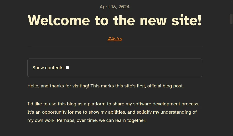
And that’s it! The page now has a dark and a light theme, with some fancy colors as a bonus! Here’s what the new colors look like in my previous blog:

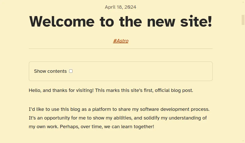
And the same page with the light theme looks like this.

You can even compare the previous theme screenshot with the screenshots above. Which screenshot is the most pleasant to look at? Do any of them hurt your eyes? I’d like to know!
Conclusion
In short, I used Astro’s CLI to create a simple blog template, and enhanced it with some accessible changes to make it easy to read. I also automated my project to update my live site on changes, making the page easy to write and easy to share with readers.
Next, I’ll continue talking about building this site, but I’ll focus on some design changes I made compared to the original blog template. I’ll share how I think about the purpose of a product, and assess whether the design is aligned with its purpose. See you then!