Building the site: Part 2
In my last article, I shared how I made my site more accessible to use. Today, I’ll talk about how I customized Astro’s original blog template to include some more personality and enhance the reading experience.
First, we’ll look at what Astro’s template has to offer. For reference, you can find the code for the template here.
Astro’s blog template
Here’s what the template’s home page looks like:
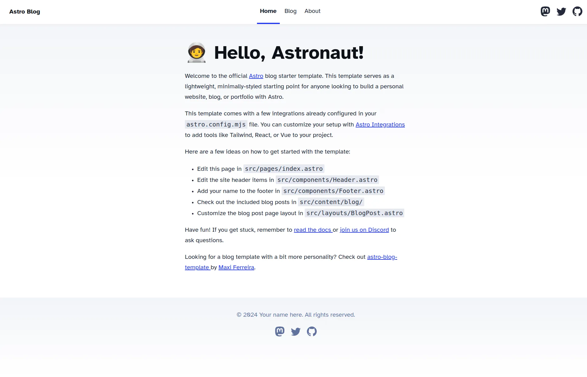
Some parts of the template were good. The layout of the header, main content, and footer worked well for my needs. Additionally, the font used is the highly readable Atkinson Hyperlegible Font.
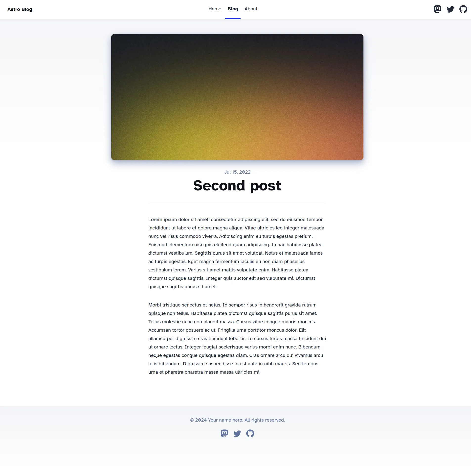
The blog page was also nice. It included a place for a large image on the top of the page, and the layout was nice to view on all screen sizes.
Blog posts also looked good without a hero image.
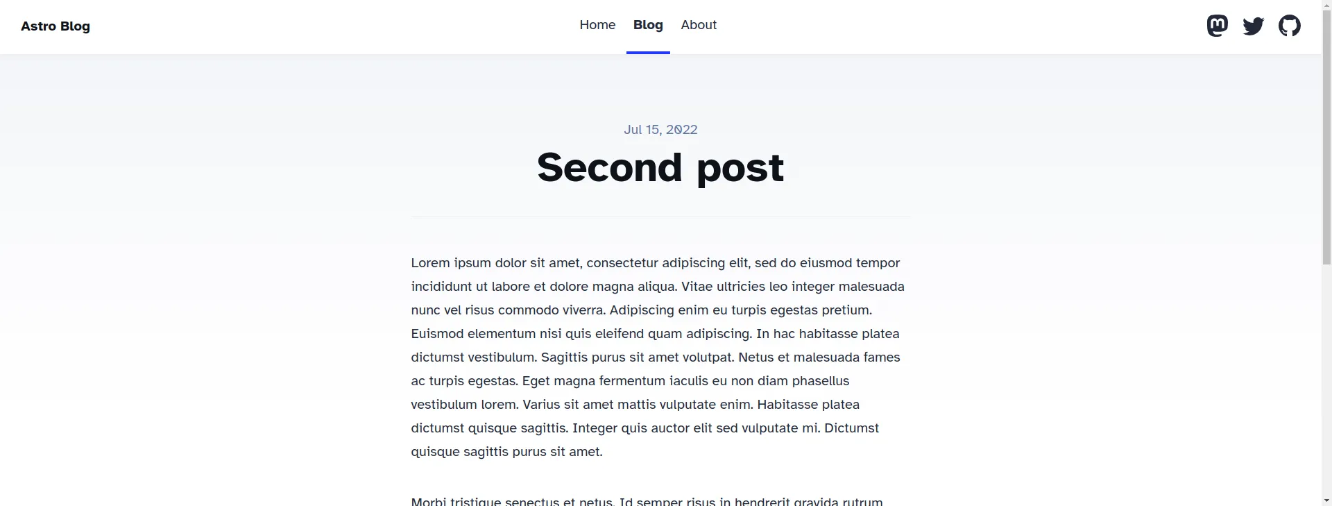
I kept the blog page the same for the most part. However, there were still some parts I wanted to change.
I need a (new) hero
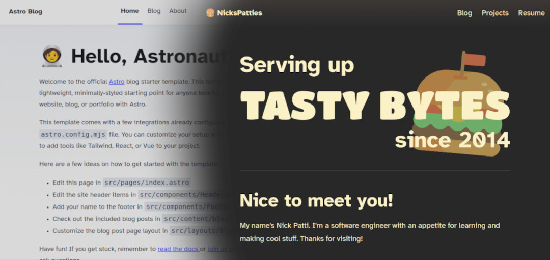
Hero elements are the first thing a user sees when visiting a site. They contribute to whether a user will stick around after arriving. I initially attempted to work with the original template, as you can see below.
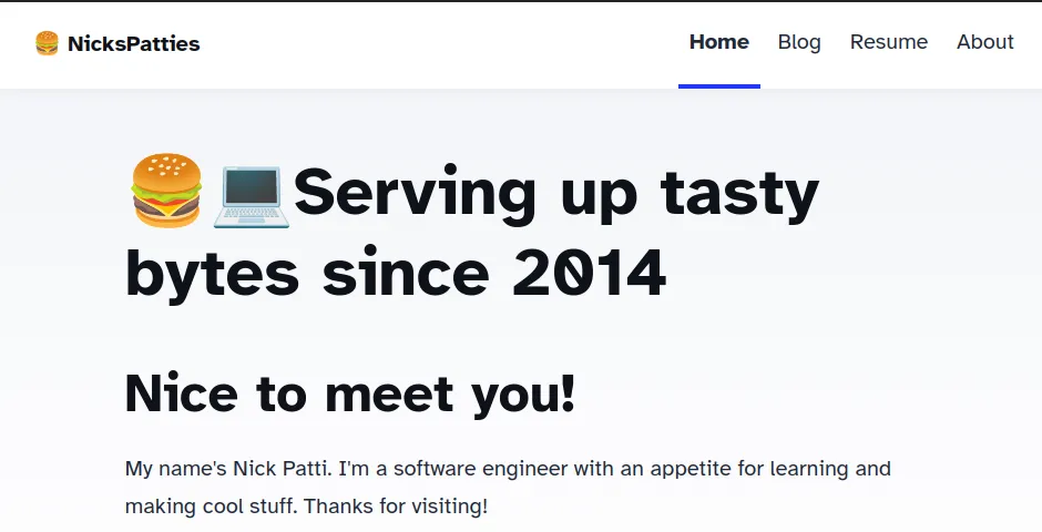
I was not impressed with the results.
To fix my distaste for my home page, I created a new header section with some HTML and CSS. My design needed to do these things:
- Feature a fun image of a cheeseburger behind some text
- Support variable screen sizes, from desktop monitors to cell phones
The HTML is pretty straightforward; I created a container for the heading and the image to reside.
<div id="content-start" class="hero">
  <img
    src="burger.svg"
    alt="A cartoon cheeseburger with a flag sticking out"
    class="burger"
  />
  <h1>
    <span class="serving">Serving up</span>
    <span class="tasty">TASTY BYTES</span>
    <span class="since">since 2014</span>
  </h1>
</div>
You may be wondering why I’m explicitly including an image in the HTML. After all, if I want an image to appear behind the text inside this <div> container, then couldn’t I make the <div>’s background the burger image with CSS?
Although that’s true, I wanted to have more control of the burger’s position and rotation. The background-position CSS property only positions an image based on an X an Y coordinate relative to an element’s container. I could move an image around, but I couldn’t rotate it.
Having the image as its own element allowed me to move and rotate the burger freely. The CSS that styles the burger image looks like this:
.hero {
  position: relative;
}

/* ... */

.hero .burger {
  position: absolute;
  height: 100%;
  top: 0;
  right: 0;
  opacity: 0.66;
  z-index: -1;
  transform: rotate(5deg);
}
With the burger in proper alignment, I addressed the text next. I wanted “TASTY BYTES” to stand out from the rest of the heading. The font should look fun and chunky, like the cartoon burger. Rodrigo Fuenzalida’s Titan One font worked great.
With these changes put together, the new hero for my site looks like this:
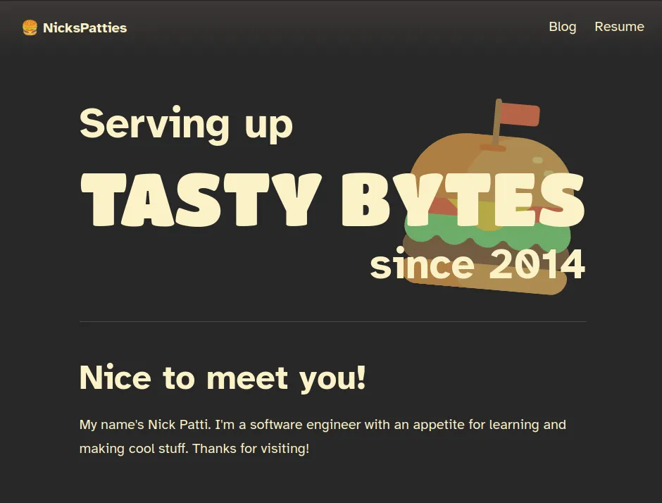
Overall, I like the changes! The hero now has some fun elements that are more eye catching than the previous iteration. Is the hero element more fun to you? I’m happy to hear what you all think!
The card component
Let’s talk about the cards next. These are the links that take readers to each individual post.
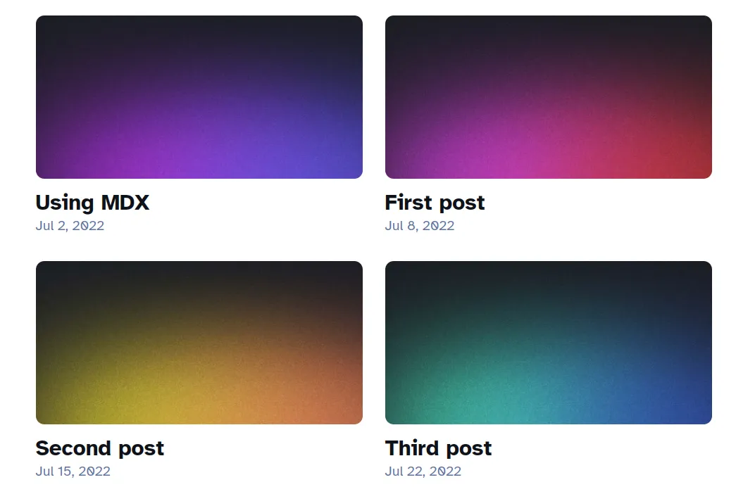
Cards present a way to show the reader what an article is about in a quick glance. Like video thumbnails, cards are also designed to draw in a user’s attention.
There are a couple of things I don’t like about these cards, though:
- I may not want to provide an image to make it easier to write my blog entries.
- The prose of the blog should be the center of attention, not its image.
Since blog posts may not have an image assigned to them, let’s first see what happens when I remove an image from a blog post. How does the card look, then?

As you can see, the card for the post “First Post” renders a missing image icon. This is not good at all; the blog card looks incomplete and broken! To remedy this, I added a CSS fallback to show a background color:
a {
  /* ... */
  background-color: var(--bg2);
  /* ... */
}
I don’t want to completely ignore hero images, however. They can supplement an article by visually describing its content. Images shouldn’t be front and center, but they shouldn’t be completely forgotten.
The Card component adds the hero image in the background of the card using the logical AND (&&) operator. If there’s a hero image, passed into this Card, then it will appear! Here’s the code.
<a
  style={heroImage && {
    "background-image": `url(${heroImage})`,
  }}
  {href}><!-- ... --></a
>
I always appreciated blogs that had links to posts that were primarily horizontal. They’re comfortable to read, and clearly display the information I care about in an article. So, I applied that design to my card components.
Here’s the final result (for now).
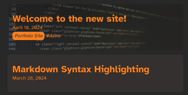
Notice that the “Markdown Syntax Highlighting” article does not have a hero image, but it no longer has a garish broken image icon in the corner of the page.
As an added bonus, when users interact with the card, I use subtle animations to invite users to interact with the link. I invite you to try this out on the blog list page!
<meta> tags
I appreciated that the blog template introduced me to <meta> tags. They can assign additional data to a webpage, which can effect how they’re displayed on social media sites.
Within the template’s meta tags are sections that cover common tags used for the Open Graph protocol. Sites use these tags to obtain information about this site when its URL is posted on their platform. Here’s Meta’s documentation about these tags, and here are the tags in my site below:
<!-- Open Graph / Facebook -->
<meta property="og:type" content="website" />
<meta property="og:url" content="{Astro.url}" />
<meta property="og:site_name" content="{SITE_TITLE}" />
<meta property="og:title" content="{title}" />
<meta property="og:description" content="{description}" />
<meta property="og:image" content="{new" URL(image, Astro.url)} />
Twitter (now X) also defines a series of tags that it uses for its own card components. Here are Twitter’s tags.
<!-- Twitter -->
<meta property="twitter:card" content="summary_large_image" />
<meta property="twitter:url" content="{Astro.url}" />
<meta property="twitter:title" content="{title}" />
<meta property="twitter:description" content="{description}" />
<meta property="twitter:image" content="{new" URL(image, Astro.url)} />
<meta
  property="twitter:image:alt"
  content="Serving up tasty bytes since 2014"
/>
You can see all the meta tags I use for my site in this file here.
These tags may seem abstract, but you can see the results once the site is published, and the link is posted in different places. Here’s an example of what card was rendered in Discord only with changes to the title and description.

I created a new default image which simulates my home page. Once published, my cards look like this:
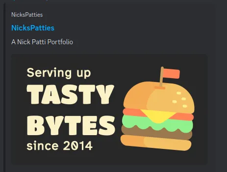
This card matches my branding and personality much better, while including the fun hero tag from the home page. It’s like a mini hero that can be featured on other sites!
Since blog posts already supported hero images, I also used that image, if there was a hero image already present. Here’s an example below:
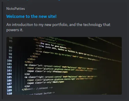
By adding this information to a webpage, it’s possible to introduce users to my content before they even visit. I wanted to make sure that my site makes a good first impression to new readers. Carefully created <meta> tags makes my site easy to share with others.
That’s it for now!
Although the default theme was a good starting point, I made some modifications to improve my site’s functionality and design. I hope these changes make the site easier and more fun to read and share.
Thanks again for reading, and see you next time!